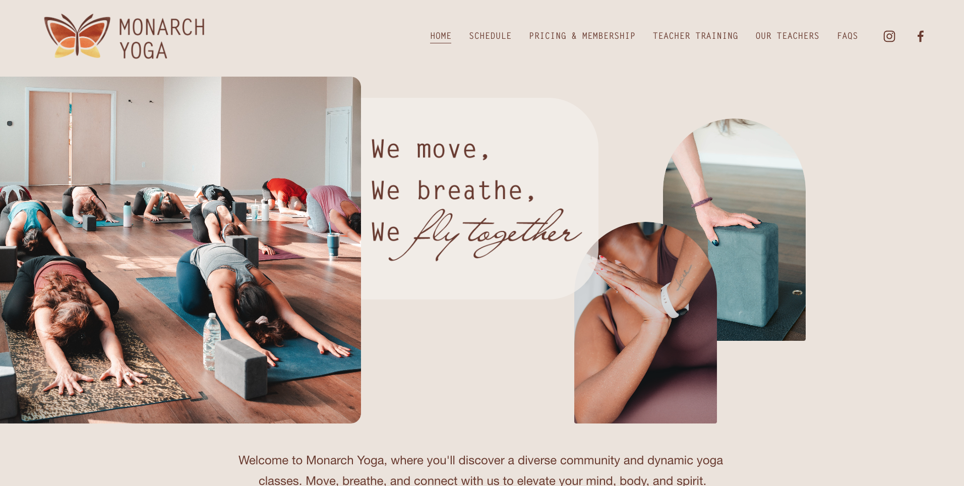
Example of Work
Website Design: YOga Studio
The GOal:
Transform Our client’s current website into a digital representation of their ethos without compromising functionality, ease of use, and brand voice.
The Result:
A Simple-to-navigate, fun-to-use website that has all the embedded features the client needs, with an omnipresent design that matches the client’s brand and community vibe.
Trust the Process
~
Trust the Process ~
The Process
We met with our client to learn all about how their business operates, what their goals were in the short and long term, what imperatives they had when it came to the functionality requirements, and more. We also spent a lot of time getting to understand the feelings and vibe they elicit through their interactions with their clientele so we could better capture and display what it meant to be a part of the yoga studio’s community.
Once we had an idea of the website direction we dove into the development and design work. We worked through over 5 different design themes before we got to the one we felt comfortable showing to the client. At the end of the day, we focused on a layered approach with soft corners, supportive structure-style shapes (arches), and a color palette that felt warm, earthy, and grounded. We also worked closely with the client to generate professional photography assets that played a key role in the final visuals of the website.
Pages Built: 9 desktop, 9 mobile
Timeline: 4.5 weeks
Review Sessions: 3
Custom Integrations: Mindbody scheduler, Mindbody button skins, pop-up marketing banner
Design Elements
We used a variety of shapes, colors, texts and layering to create fun, visually interesting web browsing experience that drive intrigue but stays out of the way from those looking to take action!


